Using data has been essential to Outfit7’s success. As the company grew, it started relying more and more on those of us in the Analytics department in key decision-making processes. It was obvious that our department would have to grow to keep up with what the company needed, but we didn’t want to bloat the team and face diminishing returns. The way we were able to keep the Analytics team compact despite an increasing workload is by automating repetitive high-level tasks.
At the moment, our analytics team is comprised of 12 data scientists from a mix of backgrounds, like mathematics, psychology, computer science and finance. A big part of our job is analyzing game feature performance so we can identify opportunities for improvement. But we don’t just track basic stats. All of us try to dig deep and understand why users behave the way they do. In order to have the time to do this properly, we needed to establish processes that work for us, not the other way around.
How we optimized AB testing
In the gaming and web industry, AB testing is a very common part of our lives. Outfit7 has up to 350 million monthly active users, so we don’t want to make a change that would negatively affect even the smallest percentage. That’s why we always test different scenarios to create the best user experience.
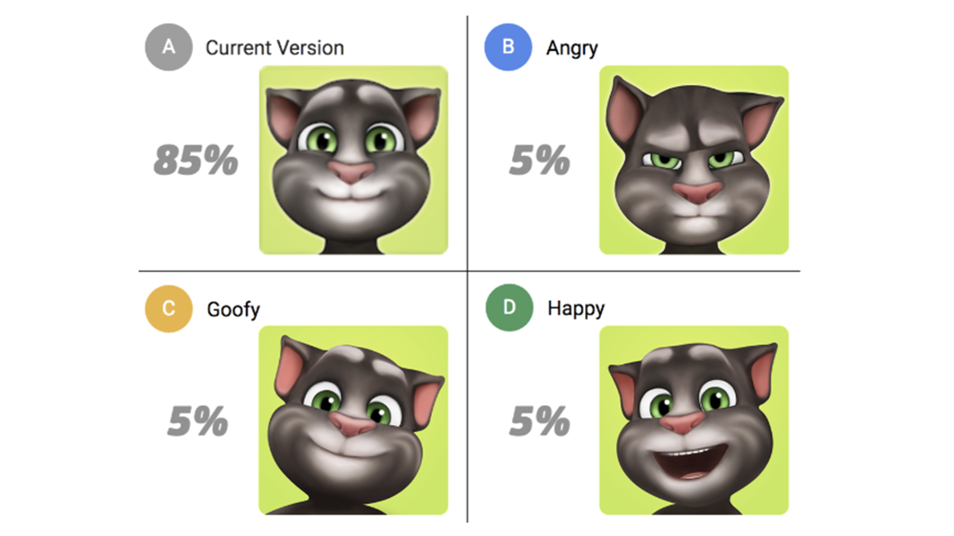
Fig. 1: Here is an example of an AB test about icons. We want to use a new icon, but first we want to see which one would work best for our users.
When testing the performance of our games and app store listings, we rely on many different metrics, but three of the most important ones are:
Retention: the percentage of users that returned to the game several days after install
Session duration: how much time users are spending in the game
Lifetime value: how much revenue the average install is generating
We include these three metrics in every report and look at them from different perspectives by creating multiple visualizations and analyses. This used to mean that we spent a large chunk of our time plotting metrics for AB test reports. Looking back, we were constantly answering the same types of questions and performing similar tasks every time we did a test.
Actually, we still do all of that, but now it only takes one simple query or even just a click to prepare the data. Before automation, one data scientist could analyze a handful of tests per month, along with one additional bigger task. Now we can do all that in a week.

The road to automation
Broadly speaking, these are the most important steps to automate a process in data analytics:
Select what you want to automate
Make sure everyone on the team can safely update the code
Create a daily job to execute the code
Create an easy setup environment
Create a nice UI to display the results
The first step was clear for us: we knew we wanted to automate AB test reports as much as possible. First, we selected all the metrics that were in every report and weren’t app-specific – I already mentioned the three main ones above. These metrics form the high-level basis that we start from before digging deeper into specific user data.
However, there was another problem we needed to solve before we could automate reporting. We generate terabytes of data stored in billions of rows every day. That means we need to constantly optimize to avoid bloated storage and long query times.
Because we’re usually only interested in a limited number of metrics, we created user aggregates. That way, we only have one table per day that stores each active user in one row. So, for instance, instead of having sixteen rows for a user that opened the app 16 times, we only have one row with a column that tells us how many times the user opened the app. This allowed us to reduce the size of daily tables to 0.5%, resulting in faster execution time for queries and lower costs for both querying and storage – win, win, win.
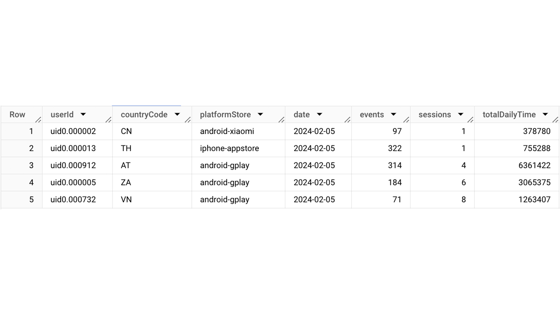
Fig. 2: An example of aggregated data. One user from Brazil had 5 sessions (sessNum) on 18th June 2019 and stayed in the app for 19 minutes (calculated from sessDayTime in milliseconds).
As awesome as these aggregates are, they have one problem: we lose the order in which a user performed actions. We can’t know if they watched a video and then fed Talking Tom, or the other way around. Because we may need this information, we still save all the raw data.
Getting everyone on the same page
After we decided which metrics we want to have calculated automatically, we had to make sure everyone on the team can update the code and do it safely. The first step here is to decide where and how the code will live. This is important, because all team members should be able to change or add something to it, so everyone should know the language.
We were already using BigQuery from Google, as it allows us to handle the massive amounts of data we get every day. However, half of our team was using Python for additional pivoting and visualization and the other half was using R. In the end, we all sold our hearts to R, because of its awesome ggplot package.
Now that we decided to use R, we had to make sure everyone can update the code safely. We used to rely on iPython notebooks for that, but that could quickly get messy as there’s no version control. We started developing and testing our code locally and – finally – migrated to Git.
Let the job do the job
Having set up all the code, we still needed to run it every day. Since our goal was to decrease manual work as much as possible, we had to find an automated solution. When we migrated to Git, we also started using a scheduling tool to run our code. Besides doing a lot of work for us, this also made our code updates safer and improved error handling.
However, since we had so much data, the daily jobs set up in AirFlow still took forever to execute. When you need to import more than a million rows of query results to the server, it can take a long time. Part of our solution was to move the calculation of tests to BigQuery, but it wasn’t enough. The solution was to stop calculating metrics from raw data. Since we were already creating user aggregates every day, we just started using them for AB tests as well.
By moving calculations of statistical tests to BigQuery and using user aggregates, we decreased execution times from more than one hour per test to just a couple of minutes.

Set up should take minimum effort
Our daily job now knew what to plot for each metric, but it didn’t know which AB test this needs to be done for. To add an AB test to the daily job, we need to write info about it somewhere, but preferably not directly in the code. A detached file or database works best.
Since we were already using Google services, we decided to use Google Sheets to store internal test configuration. Back when we were using iPython notebooks, access to Sheets was really difficult without writing your username and password on the server. But since we migrated to BigQuery, we were able to use an awesome built-in feature to directly access Sheets.
To add an AB test, all we need to do is write down a short description of groups and wait until the next morning to let the daily job do its thing.
That’s a broad overview of how we optimized the way we create reports on AB test. We also built in a few other useful features, like a column where you can create different data selections – for example the platform used (“iphone”, “ipad”). This filter is then applied to all plots automatically and displayed in addition to non-filtered ones. We use this to see what kind of effect the test has on different segments. You can filter by platform, country, install date or a mix of factors. Fig. 3: If we need results from one AB test on different segments, we add rows with defined clusters. In this AB test, we were interested in users from the US using iOS only.
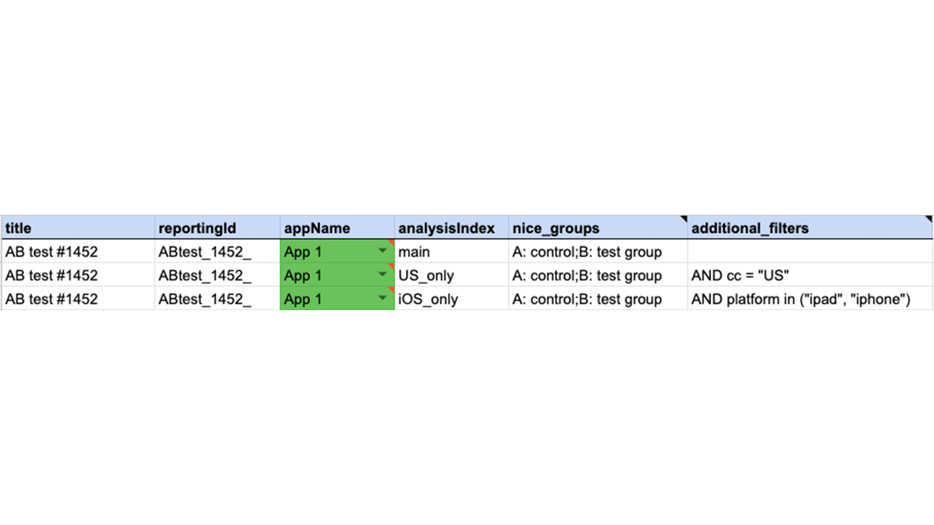
Fig. 3: If we need results from one AB test on different segments, we add rows with defined clusters. In this AB test, we were interested in users from the US using iOS only.
Last step: looking good
Now that we have the code in R, everything in Git, a daily job to create plots and an easy way to add new AB tests, we just need to easily display everything so we can create reports.
We use a package in R called Shiny to create a dashboard where we can view, browse and group metrics. This isn’t just nice to have – because we have a huge amount of different metrics, being able to quickly sort through them in a neatly designed dashboard is essential for efficiency.
This entire system took some effort to implement and perfect. However, it saved us a much larger amount of time in the long run. When we run a new AB test, we add one line to a Google Sheet and return the next morning to collect our neatly generated plots.
The daily job collects all aggregated data for that test, manipulates it as required, calculates statistics and plots everything, preparing enough plots to create reports as long as 50 pages. Instead of losing time on performing high-level tasks, our team can now dig deeper for additional insights or do advanced analyses on things like game performance or user churn.
By automating as much of our work as possible, we freed up time and resources to dig deeper into our field and get to all the tasks that used to get pushed down the priority list. It makes us more efficient and it makes our jobs a lot more satisfying.
Disclaimer: This article does not address personal data collection, processing, storage or sharing. Please note that nothing in this article should be interpreted as commenting or assessing personal data compliance. Outfit7 handles personal data and privacy with the utmost seriousness and is in compliance with GDPR and all relevant compliance regulations.